
All images © Wesley McPhail, McPhail Fine Art, unless otherwise noted. No images may be copied without permission.

Fisherman’s Break 2.0
This is a variation on previous piece that I’m painting for my wife. It will likely replace the original that is currently on offer in the store.

Revised Color Palette
The original composition was gray and a little cold. The goal with this revised composition is to “warm up” the piece.
Colors are (left to right) Payne’s Gray, Alizarin Crimson, Burnt Umber, Cadmium Yellow, Grayed Teal, Teal, Beige, and Light Pink. Titanium White was added after the photo.
Like the glass palette? I can make you one.

In Goes the Sky
I tend to paint m compositions from top to bottom, back to front.
I knew a more vibrant sky with more glow in the clouds was key to “warming up” the image, so I used teal mixed with touches of light pink.
I worked quickly and did not clean my brush between colors, feeling that the random color variations would add to the realism.

Blending
I used red sable brushes to blend away the brush strokes and smooth out the surface.

“Six-gun Daydream”
This piece will feature a vintage cap-gun that my father-in-law passed down to my son. This heirloom harkens back to those thrilling days of yesteryear, when back yards and city parks became the untamed wilds of the romanticized west.

Variations on Lukas 1862 Blueblack. This is a similar shade to traditional “Payne’s Gray,” but with a little more blue in the mix that becomes very apparent with the addition of “Titanium White.”

“Naples Yellow” lightened with “Titanium White” and some “Burnt Umber” accents form the pistol grip.

Added in the worn out steps with a mix of “Burnt Umber,” “Transparent Brown Oxide,” and various amounts of “Titanium White” or “Blueblack.”

The “Ranger Mask” was blocked in using straight “Blueblack” with various amounts of “Titanium White” added for the highlights.

“Cornerstones” Color Palette
Clockwise from the left: Lamp Black, Dark Brown (Lamp Black + Burnt Umber), Burnt Umber, Cerulean Blue, Purple, Alizarin Crimson, Bright Red, Yellow Ochre, Beige (Titanium White + Burnt Umber), and Titanium White.

Starting with an 11” x 14” oval canvas, prepped with smooth surface overlay. Transferred image with a Pigma .005 mm pen, and then added the tooth coat for painting. This seals the drawing and keeps the marker/pen lines from bleeding into the paint. Ink lines don’t whist away like chalk, graphite, or charcoal.

Blocking in begins all with variations of Dark Brown and Cerulean darkened with Lamp Black


Continuing to block in colors and start gradations.

It’s been a while since I was able to post an update to this piece’s progress. I’m to the detail stage now.
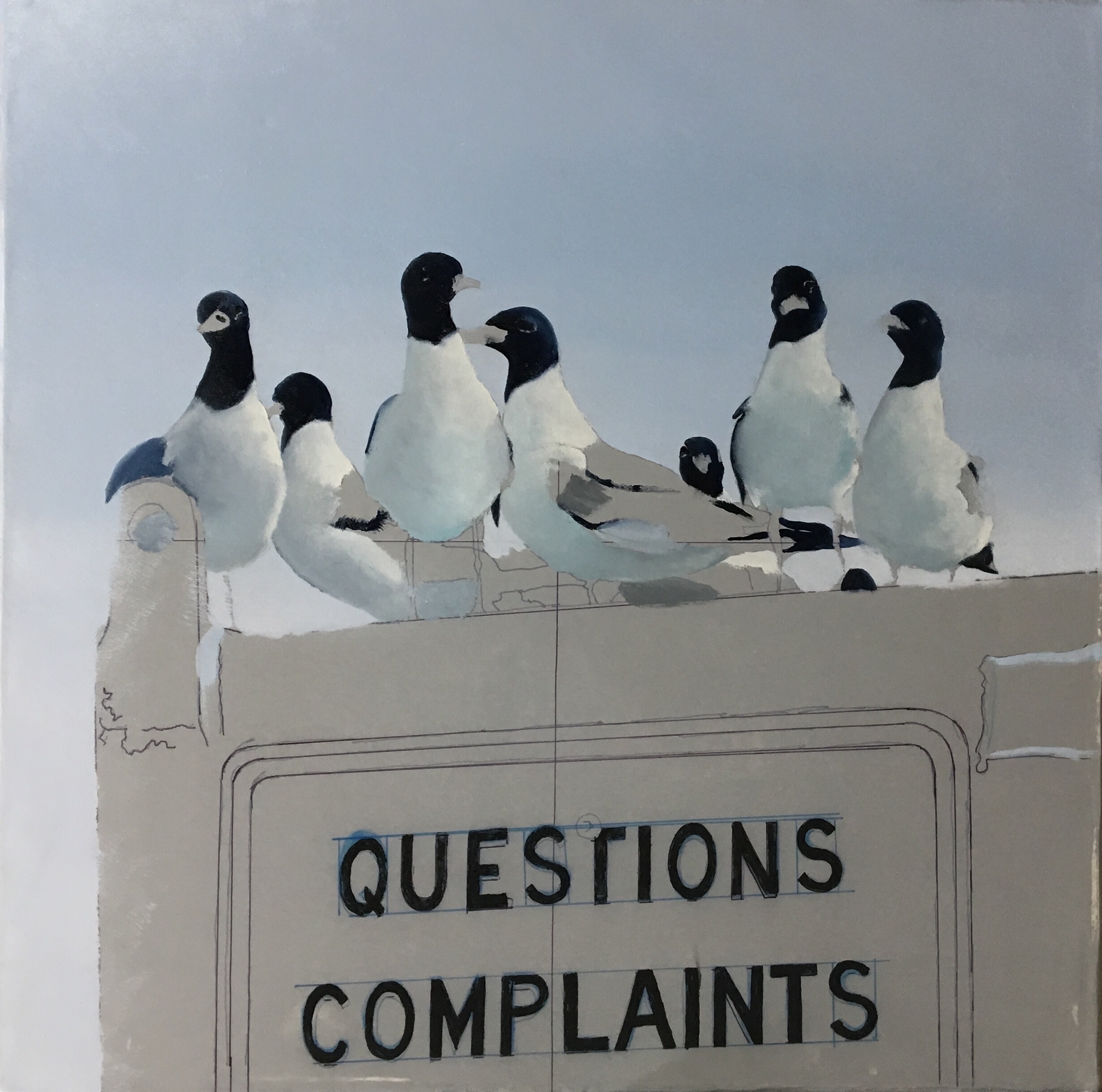
Complaint Department:
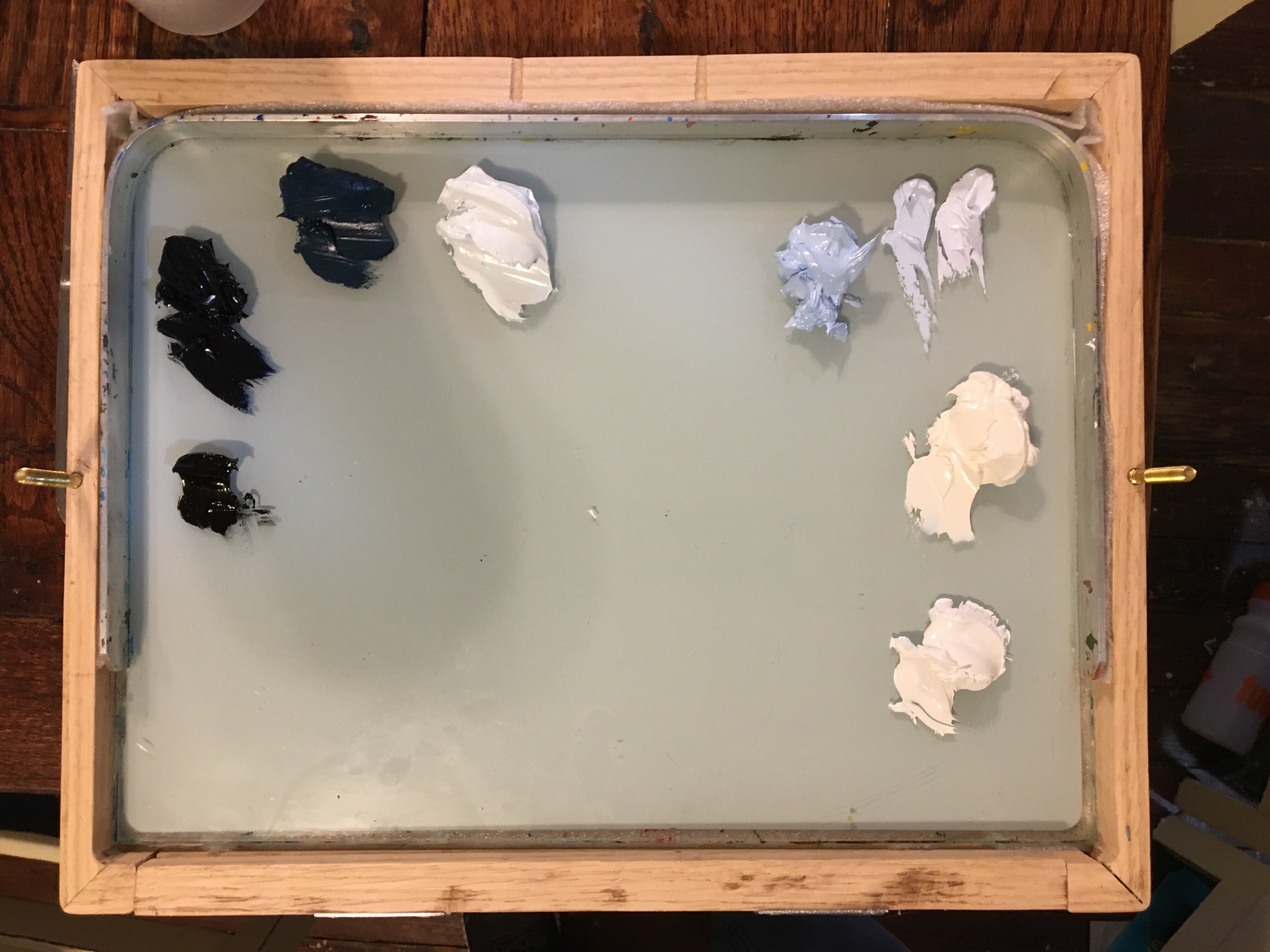
Color Palette: Lots of blue, a little black, a touch of yellow, and a mass metal f white

Complaint Department:
Session 1: Transferred my sketch to the canvas

Complaint Department:
Session 2: Laying in the sky
Complaint Department:
Session 3: Laying in the base colors for the gulls. Mostly blues thus far.

Complaint Department:
Session 7: Continuing with the gulls.

Complaint Department:
Session 10: Began blocking in color in the metal box

Complaint Department:
Attempting to mimic the honeycomb pattern on the sign has proven extremely difficult. This one didn’t work…

Complaint Department:
The lettering has also given me fits!

Complaint Department:
Sometimes there’s nothing to do but sand it down, and start again!

Color Palette For My Next Composition
This is a deceptive collection of paints. All the daubs to the left of the BROWN are variants of a single color.
Color preparation represents about an hour’s worth of work.

One Composition in Two Styles
I will be painting the Point Bolivar Light in oil using Palette Knives on a Canvas Panel and Brushes on a Smooth Hardboard surface

Palette Knife Composition - First Session
The palette knife lends itself to a fast and fluid lay down of colors and textures. It is a much looser approach than my usual brush work - and is much less strenuous.

Detail of Second Session
This piece came together so very quickly. Which is the genuine appeal of palette knife work. The whole piece was finished in less than five hours.

Smooth Brush Composition - Session 1
In comparison to the piece below, the smooth brush/smooth surface technique takes considerably longer. Whereas palette Knife is all about texture, the smooth brush technique relies on a satin like surface with no noticeable texture at all..

Continued
Once the colors are laid in, they must be blended, and all traces of brush strokes removed. This picture represents 3.5 hours worth of work.

Aged Metal…
Achieving the look of 180 year old, rusted, cast iron has proven a challenge, but it’s starting to come together now!